Today’s consumer hears messages from every angle. The average person wakes up and checks their phone, where they may receive several messages from various retailers. They get in their car and listen to ads on the way to work, see billboards as they drive past and get inundated with sales reps calling.
If your website isn’t 100% on point, you risk losing them to all that other noise as different companies vie for their attention. Ensuring your business-to-consumer (B2C) site is the best it can improve the user experience (UX) and the chances they’ll purchase from you.
How Can E-Commerce Websites Improve User Experience?
Statista estimates the e-commerce market is currently worth an estimated $5.7 billion and will hit $8.1 billion by 2026. As the market grows, more and more companies will enter the cyber stratosphere.
You must compete against big names and smaller brands, so you must be at the top of your game. Here are the ways you can improve your B2C site’s user experience and a few examples of companies doing an excellent job.
1. Balance Positive and Negative Space
As a website grows, throwing a little bit of everything on the landing pages is tempting. After all, if people don’t really care about one element, maybe they will about another. The problem is that your page quickly becomes cluttered, and your audience has no idea where to look.
It’s much better to have a narrow focus that matches the interests of a particular buyer persona. You can always create more than one landing page for additional market sectors. A visually pleasing, uncluttered space sets the tone for a positive buyer experience.

Source: https://www.puma-campaigns.com/deviate-elite-aw
Puma’s “Running the Dream” campaign uses a hero shot of a woman running down a secluded stretch of road. The hero image serves as a negative space with just a headline, hamburger menu and logo above the fold. The simplicity and lack of additional details puts the focus on the headline and moving forward in the buyer’s journey.
2. Improve Your Page Speed
It might sound simple, and you probably are already aware you need to make your site load as quickly as possible. However, something as simple as doing away with scripts can change how fast your website loads for users, particularly those on mobile.
Faster page speeds can also help you rank higher in search engine results pages (SERPs). Run tests, tweak your design and see how fast you can get yours to pull up for users.
3. Add a Calculator
Offering useful tools to your site visitors keeps them engaged and helps solve their problems. Think about the pain points your user faces. How can you solve that issue through a tool of some sort?
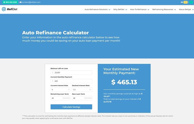
Source: https://www.refijet.com/auto-refinance-calculator
RefiJet is an excellent example of how a company can offer something aimed directly at the target audience. The brand knows anyone visiting their site is probably trying to lower their auto payment or see if they can afford a car.
The auto refinance calculator shows an estimated monthly payment based on factors such as balance, interest rate and how much time is left to pay on the loan.
4. Go Mobile First
In one recent poll, researchers found 37% of Americans use only their cell phones to access the internet. The number grows each year, and the rates of those who use both desktop and mobile devices is much higher.
Put yourself in the place of someone on a small screen device. How easy is it to navigate to different areas of the site? Does everything appear correctly? Make sure images scale down to size, buttons are easy to read and headlines don’t fall off the page.
5. Improve Your Call to Action (CTA) Buttons
The CTAs on your site tell the user what their next action should be. They can guide the user through the next step of the process. Pay attention to the language you use. Try to stick with active words. Make them personal “I” or “You.”
Make sure the button pops against the background and is easy to spot. It should immediately grab the user’s attention.

Source: https://www.dermstore.com
Dermstore uses a popup to capture leads by offering them 15% off their first order. The CTA button is bold against the white background, making it pop. The user is offered something in exchange for sharing their info. The CTA is a very simple action verb–continue.
6. Target Your Headlines
Your headlines are often the first thing people see from your brand. They can make a positive or negative impression. Headlines are often used in SERPs to show what the topic covers. You should make sure they are on point, short and detailed.
Avoid using too many helper words, such as “the.” You can also use your headline to target specific keywords the user might seek. Doing so ensures the page is shown to those who are most interested in what you have to say.
7. Improve Product Details
Many B2C websites are e-commerce stores. Of course, there are always exceptions, but if you want to improve your online shopping site for users, you must expand your product details to answer any questions the user has.
Make sure you use detailed images, answer all questions and highlight what makes your product different from others in the same category. The user should feel informed enough to make an intelligent decision about whether or not they’d like to buy from you versus a competitor.
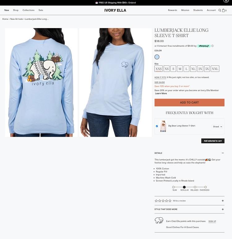
Source: https://ivoryella.com
What isn’t to love about Ivory Ella? Not only do they donate some of their profits to the cause of saving endangered elephants, but their clothes are beyond cute. Note how they break down some of the details in easily digestible bullet points. The user can skim over the facts and get a good idea of the product. The photos add to the details.
8. Add Live Chat
Although many customers prefer using live chat to telephone or in-person customer service, make sure you can staff it correctly before offering it. In a Forrester report, researchers found one in every five people said they’d left a site and never bought from the company again due to slow response times via live chat features.
Live chat improves the UX by putting a live agent in place who can answer questions anytime. It saves the user from having to go to another device to place a call or do any extra work. They simply click the chat button and type their question.
9. Use Unique, Relevant Images
Whether you sell merchandise online directly to consumers or you own a service business and aim your landing pages at finding new leads, the images you use can make or break your user’s experience.
Stock photos have a place, but whenever possible try to use images of your product and unique photos no one else has. Make sure you label them with alt tags and use only those that make an impact on the reader. Generic photos don’t add a lot to your narrative.
Put Yourself in Your User’s Shoes
Ideally, your site’s UX is something you’ll continue to improve over time. Learn to think like your average customer. Research and survey them to find out what makes them tick. What is the intent behind why they came to your site? Why are they seeking a solution like the one you offer?
Try to get inside the mind of your target audience and you’ll be able to see what features might frustrate them and which ones are most beneficial. Over time, your UX will improve and you’ll get more and more conversions.